I was delighted to be asked by The SAA ( Society for All Artists) to write a blog for their website: I’m still polishing my words of wisdom, and will post when it’s ready.
As a taster, they also asked me for a ‘Top Tip’ which was published today on their social media channels: here it is, with the two demonstration drawings.
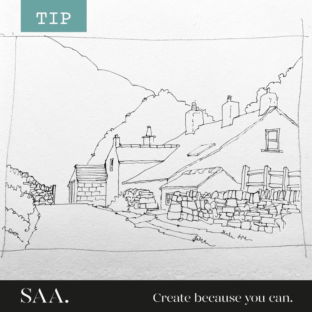
John Harrison, artist: purveyor of line drawings with watercolour is a pen and wash artist and has the answer to this often asked question: “How can I make my drawings look less flat?”
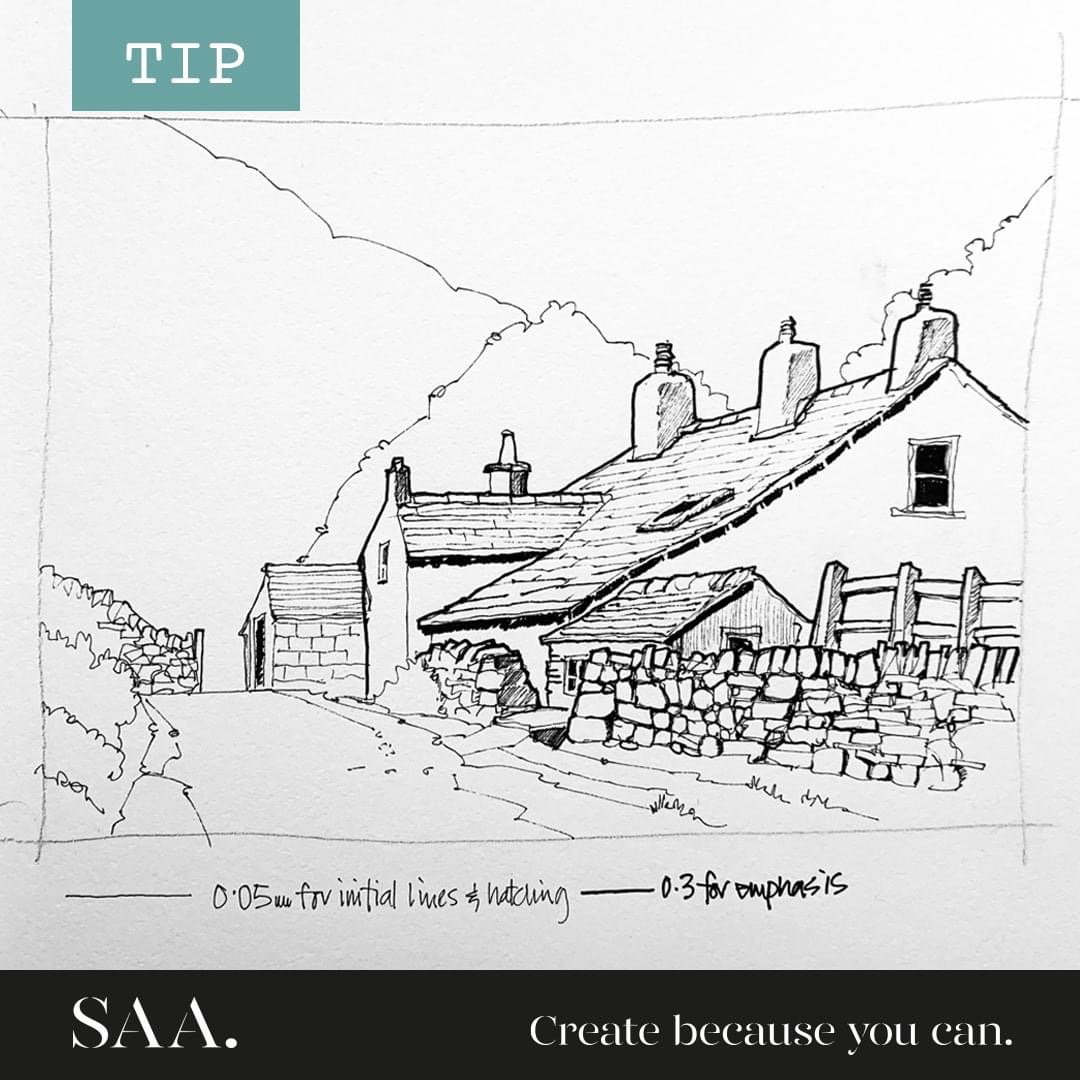
One way to achieve this is to vary the line weights that you use in the initial drawing, staring with a really fine nib.
The initial linework on the drawing was done with a 0.05 size, and the emphasis lines with a 0.3 nib.
The fine nib can also be used for any hatching, and the heavier one for deep shadow areas, which can help suggest strong sunlight.
Confining the emphasis lines to those areas closest to the viewer, and leaving those areas furthest away in the lightest lines will also help with aerial perspective to convey a sense of depth and distance.
Share your work with us if you find John’s tip helpful!
Here are the two stages of a quick demo drawing which accompanied the post:
Discover more from Drawn in Yorkshire
Subscribe to get the latest posts sent to your email.
